

The Best Jerseys of the 2021-2022 NBA Season
The 2021-22 NBA Season marks the fifth anniversary of City Edition Jerseys designed under the Nike Brand. A new season means that Nike cooked up another round of City Edition uniforms for each team. This year’s uniforms focused on the NBA’s 75th anniversary while paying tribute to each team’s most iconic moments.
It seems these jerseys keep getting better and better as the years go on into the Nike NBA contract and this season maybe the best one yet! The 6th Man Team have put their heads together to come up with our favourites from the year! Let us know your thoughts on your favourites!

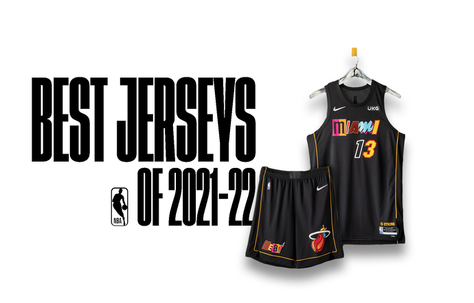
1. MIAMI HEAT

2. MEMPHIS GRIZZLIES
The uniform brings in details from throughout the team's far-reaching background, from British Columbia to Tennessee. The uniforms's main colours are the midnight blue and yellow that have represented the Grizzlies style since 2004. A stylised "Mem' wordmark from 2018 patterns through the neck, arms and shorts in a design similar to both the original Vancouver uniform and the current Statement Edition uniforms. The waistband has the "clawball" logo drawling from the original design from Vancouver and early Memphis years. The shorts have the bear logo from 2002 updated the current blue colourway.

3. GOLDEN STATE WARRIORS

4. LOS ANGELES LAKERS
While the shorts incorporate the baby blue from the original championship team in Minneapolis, the primary head-to-toe color is the Lakers purple that emerged in the late ’60s. The belt buckle includes the “L” logo from the three-peat era of the 2000s.

5. BROOKLYN NETS
Marking the team’s path from New York to New Jersey and back again, the argyle side panel is a tribute to the repeat Eastern Conference championships from the ’01-‘02 and ’02-‘03 seasons. The patch on the shorts is a throwback to the ’80s, while the red, white and blue colour blocking reaches back to the franchise’s ABA roots. On top of the navy body colour, the black space symbolises a team on the rise, poised to leave a new mark on the league.

5. PHOENIX SUNS
The Nike NBA City Edition design from the 2020-21 season is inspired by the Valley’s breathtaking scenery, using stark colors and pixelated, abstract lines to create the local geographic landscape. The horizontal striping across the chest uses a spectrum of color to create the hues for Arizona sunsets and sunrises. The classic Sunburst logo returns on the short, while the “PHX” acronym appears on the waistband.